DH150-demo-2020W
The Glass Bead Game: Undefined
DH150 2020W Sookyung Cho
Introduction: a brief information about the project.
In this project, I will propose a novel ux design of the mobile app to enhance the aesthetic experieince in local communitiies. In various context of aesthetic experience, the community plays a important role to share and culture the aesthetic taste of individuals. To offer the accessible and satisfactory user experience of aesthetics of everyday objects would be beneficial to timely and critical especially when the mis-informatioin is widely spread without warninigs.
Design statement:
Sharinig the aesthetic experience is not only contributing to the cultivation of the common sense as a member of community but also to the moral sense to practice what the inidividual judges as imperative. Providing and returning favors is one of the most fundamental process during which people form and maintain all kinds of relationships with each other. Plus, we all have times at which we really need a helping hand. The favor-exchange app allows for people to find help and help others efficiently within their community, with the potential to gain monetary compensations, and more importantly, the opportunity to get to know and initiate exciting new connections with people in their communities. by Qirui Wu – read more…
Competitor analysis: Heuristic Evaluation
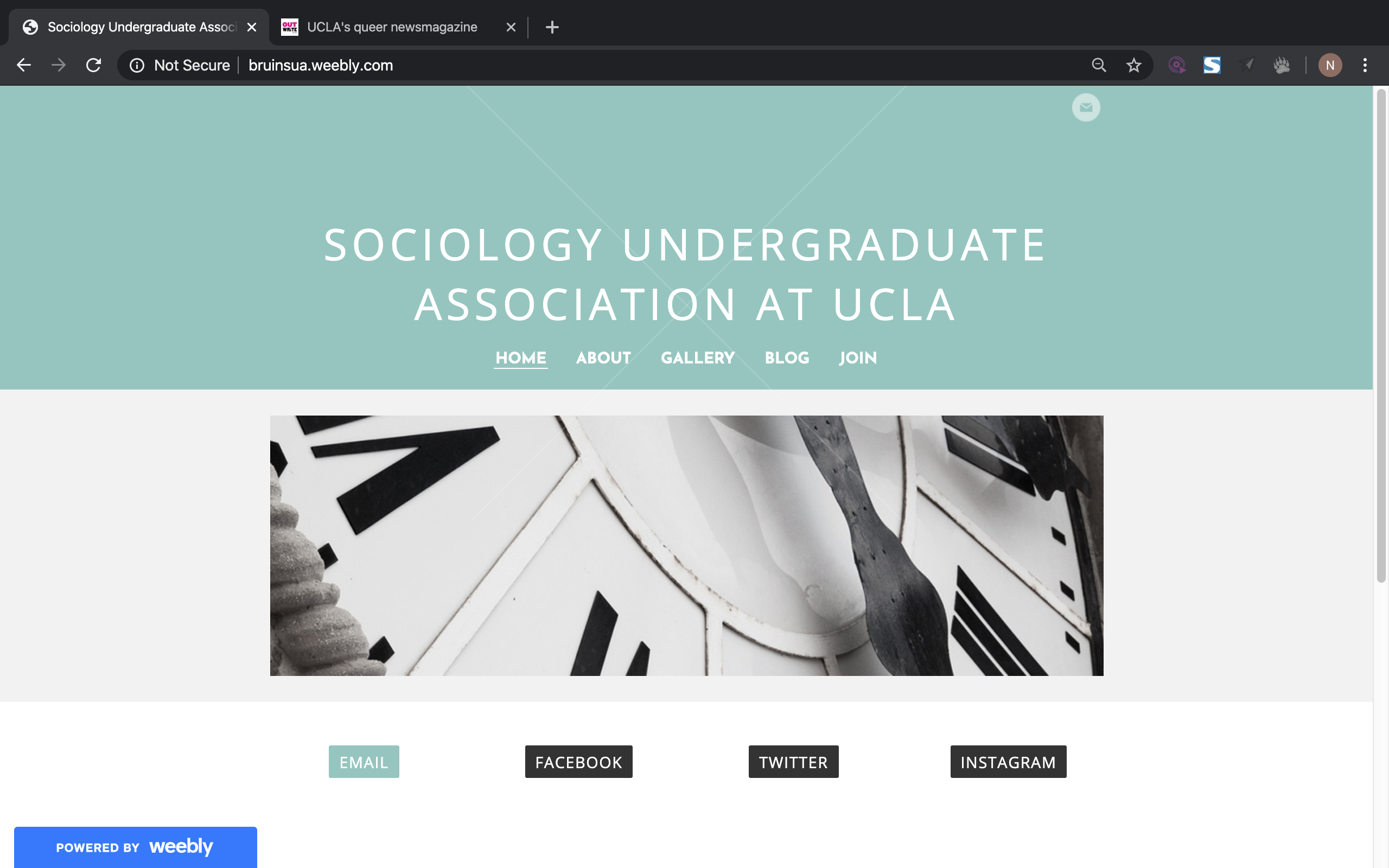
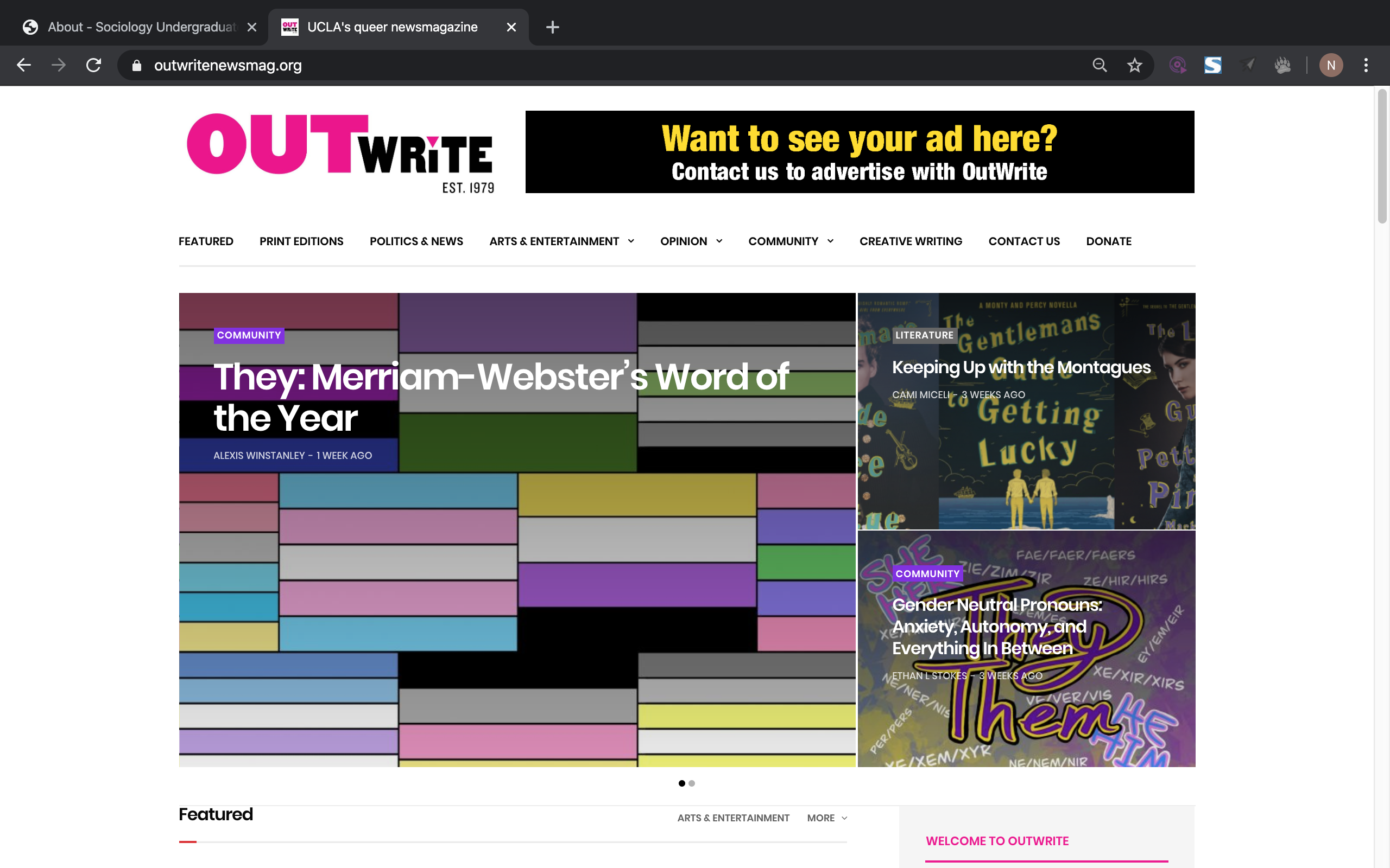
I choose to focus on the undergraduate student organizations at the University of California, Los Angeles, particularly by analyzing the official websites designed for two on-campus organizations: Sociology Undergraduate Association and OutWrite Magazine. I aim to recognize, detect and analyze both websites following Jakob Nielsen’s 10 Usability Heuristics for User Interface Design to identify usability problems. by Naomi D - read more…
 |
 |
Competitor analysis: Usability testing
I conducted a usability test to understand the extent to which the app’s design facilitates or hinders a user’s ability to complete routine tasks. The test will try to capture the effectiveness, efficiency, and satisfaction of the UCLA Bruins mobile app. Task 1 will ask the user to check past basketball game scores and future event dates;Task 2 will test the user’s ability to efficiently purchase tickets for an upcoming sports event; Task 3 asks the user to personalize his/her experience on the app by subscribing to a particular sport and modifying its notification settings.
With regards to the UCLA Bruins mobile app, I learned that it has major design flaws that make its use cumbersome and frustrating for the user. My participant was able to complete each task, but she expressed difficulty in doing so both through her verbal indications during the test and in the post-test questionnaire, where she describes the app as cheap, intimidating, and unprofessional. She noted that the lack of internal consistency and cluttered interfaces of the app made it hard to navigate and perform basic functions of the app. by Josh Mimura – read more…
User research [contextual inquiry]:
This project will support users activity and need for safety to provide improve user experience in parking in a proper location and seeking safety information. Current solutions to satisfy this need for knowing where to park include other applications but from personal observation, do not seem to be very commonly used among my target demographic. Certain limitations for traveling and parking include not knowing availability ahead of time and as a result, spending a lot of time looking for parking or not heading out to a destination at all. Added functionality to the ParkMobile app could definitely help users discover places that they feel comfortable visiting due to positive parking situations and ensure that they become repeat visitors. I employed participatory observation and ethnographic research by observing how people in UCLA Parking Structure 2 seem to be paying for parking. by Tasia Mochernek – read more…
UX storytelling [persona+scenario]
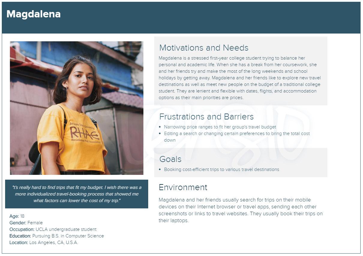
M’s Price Tool - suggests what details of your trip to change (such as travel dates, location, airport) in order to fit a designated budget and price range
| Magdalena, an undergraduate college student, is excited to go on a trip with her friends for spring break to celebrate the end of finals. She is looking to book a bundle trip to Cabo, Mexico for 5 people for $300-$400 per person. Magdalena is constantly stressed and overwhelmed with work for her packed course schedule. She and her friends look up deals on their mobile devices and laptops during their study breaks and send screenshots and links to track possible options in their groupchat. Magdalena and her friends are looking for a cost-efficient, all-inclusive deal that fits their budget. They are open and flexible with flights and accomodations. Use Case: Magdalena opens her travel app and searches for bundle packages to Cabo for five people between the dates of 3/21 to 3/29. She sorts her search results by price. When she cannot find deals between her price range, she becomes frustrated and edits her search. She changes the travel dates and starts a new search from 3/22 to 3/28 to see if the prices are cheaper. After finding a deal within her price range, she checks out the hotel and selects her inbound and outbound flights. Before proceeding to the checkout page, she takes a screenshot of package summary and sends it to the groupchat. [by Priyana Patel - read more...](https://github.com/priyanapatel57/DH150-UX/blob/master/assignment05/README.md) | 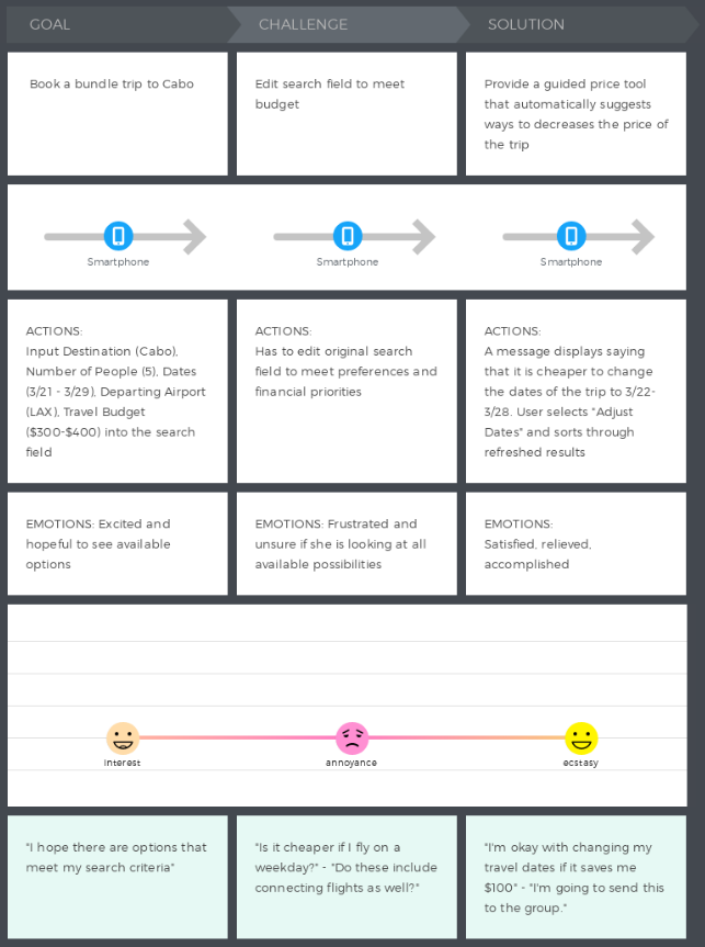 |
Wireframe and graphic design element variations

These initial sketches show the process of signing up with the app and discovering the clubs the student’s campus has to offer. If the students have an account, upon signing in the students will be directed to their home page. In their profile section, they can see and edit their profile (how clubs and others in the system see them). The profile shows their name, year, major, and photo. They have the option to include a short bio about themselves. The section lists out all the clubs and communities that the individual is involved in or a member in, and displays the user’s status (e.g. a director or a member) in the said organizations. Essentially, this is a snapshot of the user’s involvement on campus. by Samantha Chandra – read more…
Low-fidelity prototype (wireflow and testing)
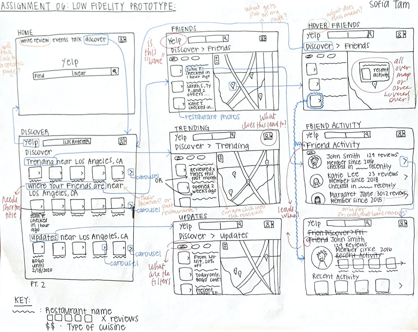
The purpose of this low fidelity prototype is to document the flow of these three features previously described. These wireframes show the potential screens that these features would have, and the wireflows document how the user would navigate through these screens. Low fidelity prototypes are useful to see how the user thinks when presented with a potential solution, and allows people like me to observe how the user thinks and logically map out how the new features will behave. by Sofia Tam – read more…
High-fidelity prototype (functional/interactive prototype)

This prototype of the book recommendation and listing service bookcore showcases the keyword and category search features, similar search feature, and book listing feature of the website with high fidelity to the intended product. Building this prototype, I aim to get a better sense of where users have difficulty and find best usability using bookcore to make design and usability improvements, useful features, best flow, and most intuitive design. I built this prototype using Figma, designing all screens and components myself from scratch based off of my low fidelity wireframes and wireflow with improvements made based on peer feedback. by Ellen Mei, read more…
Optional evaluation and revision history
Including cognitive walkthrough; impression test, accessibility audit, usability testing), per each summary and link to the notes (when you share the video or other detailed evidences, I will notify you when you can make the contents private as soon as your work is graded)
Pitch video

Conclusion: what you learned throughout the process
While timeframe for projects are finite, ideas for implementations can be infinite. Sometimes it is more important to prioritize the most important features and design those well, rather than designing for every-single-feature and creating a “cool” but unusable app. With deadlines approaching and ideas still flowing, I realized I had to focus on the quality of the most important components of the product before letting myself get carried away with “cool” features I wanted to add. This allowed me to stay focused on creating a solid and quality prototype that could be improved and added onto overtime. by Serene Spakkul - read more…