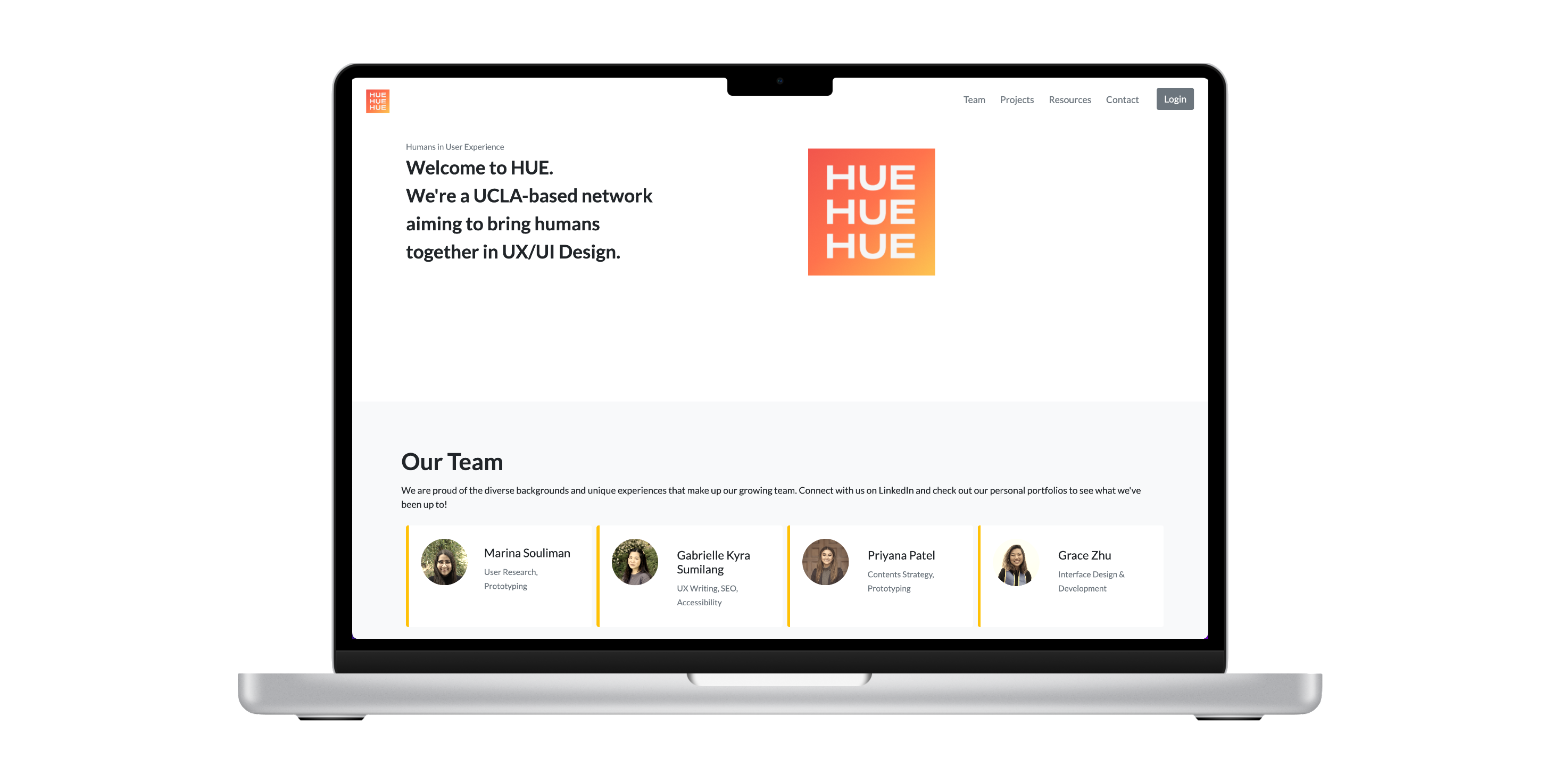

As a start, we wanted to create a web platform to network, collaborate, and learn in order to be better prepared for professional UX opportunities.
"I want to be a UX professional but I don't know how to start..."
Many students at UCLA are interested in getting into the UX space, however, they are unsure where to start. A typical UX job requires 3+ years of experience for applicants and most internship opportunities are discipline-based, therefore students from an interdisciplinary program like Digital Humanities with non-design and non-programming experience are hardly exposed to professional user experience project experience. This is despite the fact that UX research and design require a strong sense of humanities, exploring “human-centered” experiences, beyond technical skills design and programming.
To provide a web-based networking space between design and research volunteers and clients, with projects focusing on humans in the human-centered design process.
The volunteers will acquire the practical skills and outcomes by participating in a project, partly or fully as much as they can contribute; while the clients can have creative design solutions based on human research conducted by truly interdisciplinary (or transdisciplinary) team members.
How might we build up a network space to help each other on UX projects?
The design process for the product development (HUE) and web presence design (2020).
The team interviewed peers at UCLA and completed a self-questionnaire to explore how individuals explore their career interests in user experience. Here is a summary of the findings:
| Theme | Details |
|---|---|
| Future Career Goals | UX Designer/Researcher with a focus on humanistic research, aesthetic judgment, and experience |
| Strengths or Weaknesses | Strength: Empathy, Attention to detail Weakness: Confidence experience |
| Common Challenges | So much to learn, imposter syndrome - Research + data + craft/prototype experiences Social issues + humanistic purpose |
| Expected Outcome | Connect + collaborate + like-minded individuals Real-world problems Freelance Experience |
| Competitive Analysis | (Slack, Discord, Behance, Wix, Squarespace, Handshake) Overwhelming + difficult to keep up-to-date Portfolios - What to present? Feedback, Templates Meeting other individuals interested in UX through job-searching sites (Handshake, LinkedIn) |
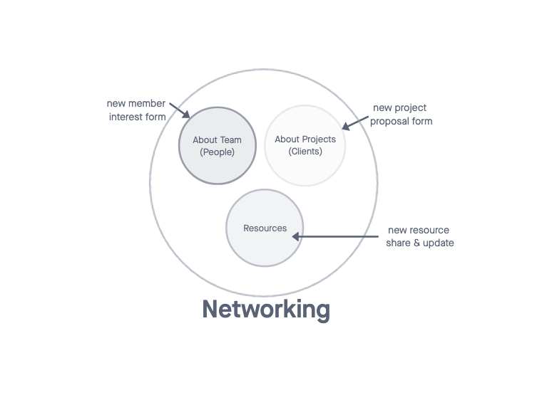
Based on findings between our own responses and expectations for a UCLA-based network, we outlined the key features of members, projects, and resources as what we wanted to see on our platform:
Four types of personas can be involved in this networking project:



When deciding on the title of our design consulting project, we wanted to touch upon each of our team member’s roots in Digital Humanities. In striving for a humanities-based brand, we came upon HUE, an abbreviation for “Humans in User Experience”. While UE is not a common abbreviation for User eExperience (UX), we felt this was a part of our platform that we could leverage and differentiate ourselves from other UX networks. HUE is also a play on the design terms meaning a color or shade.

Three main features of communication, collaboration, and information sharing are provided through the website.
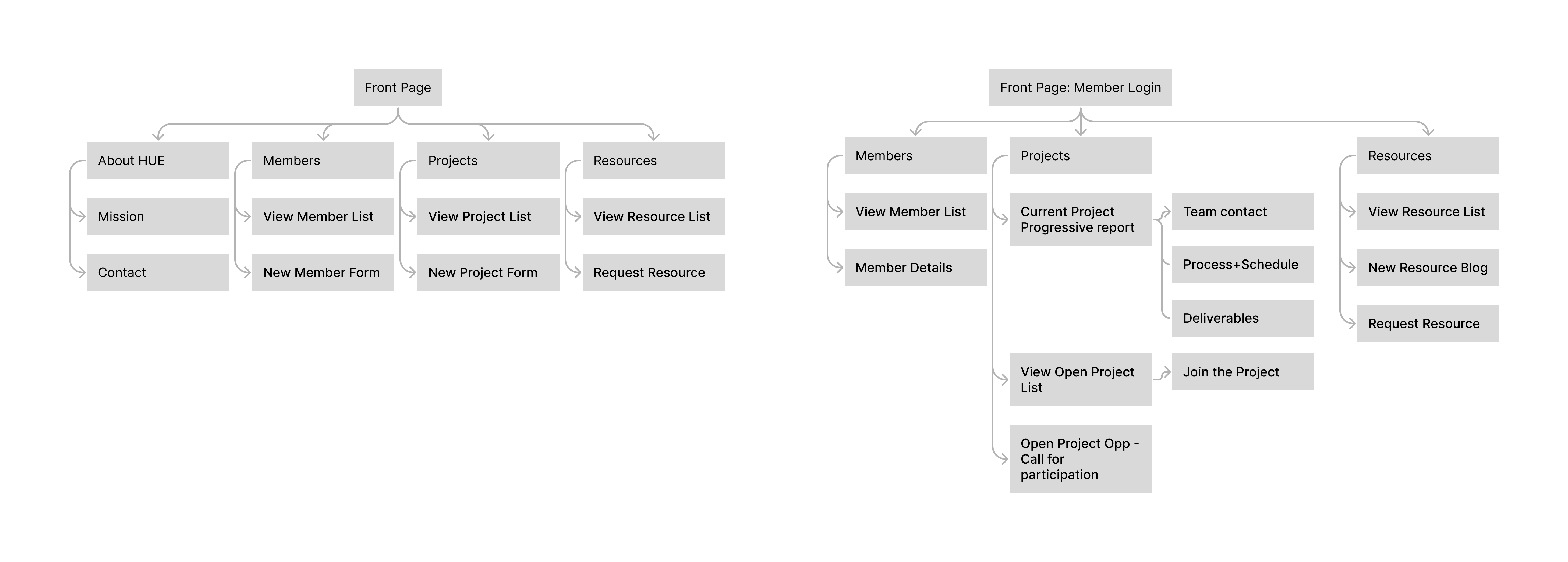
Here are the key wireframes to test the core content and the layout.
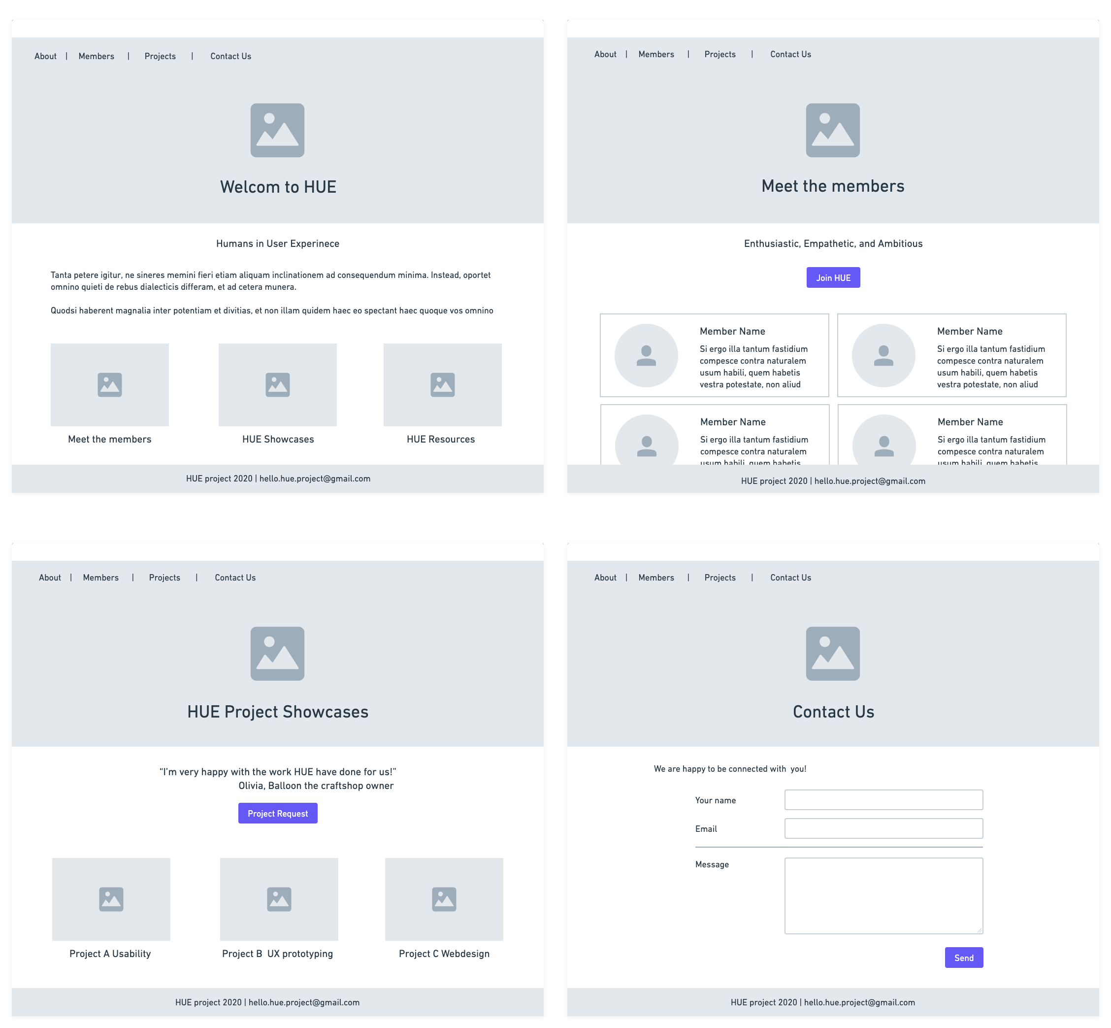
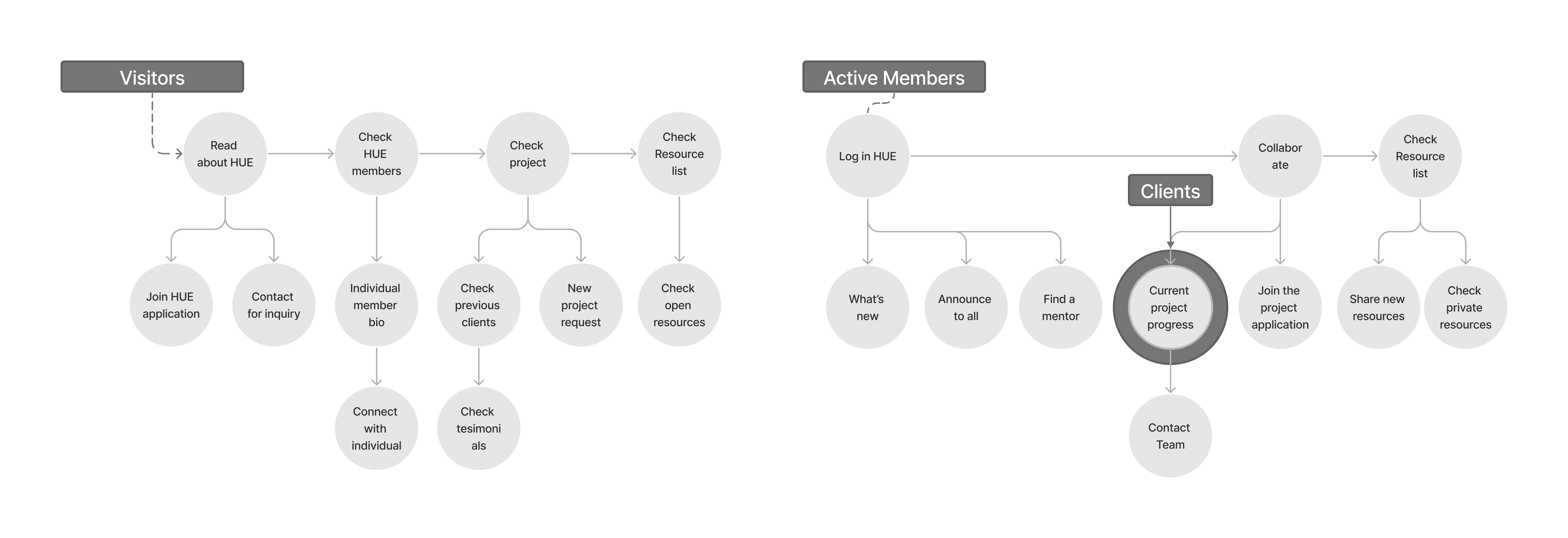
Depending on the user's situation, for non-members, current working members, and clients, users can complete different type of communication, collaborative relationship building, and information sharing tasks.
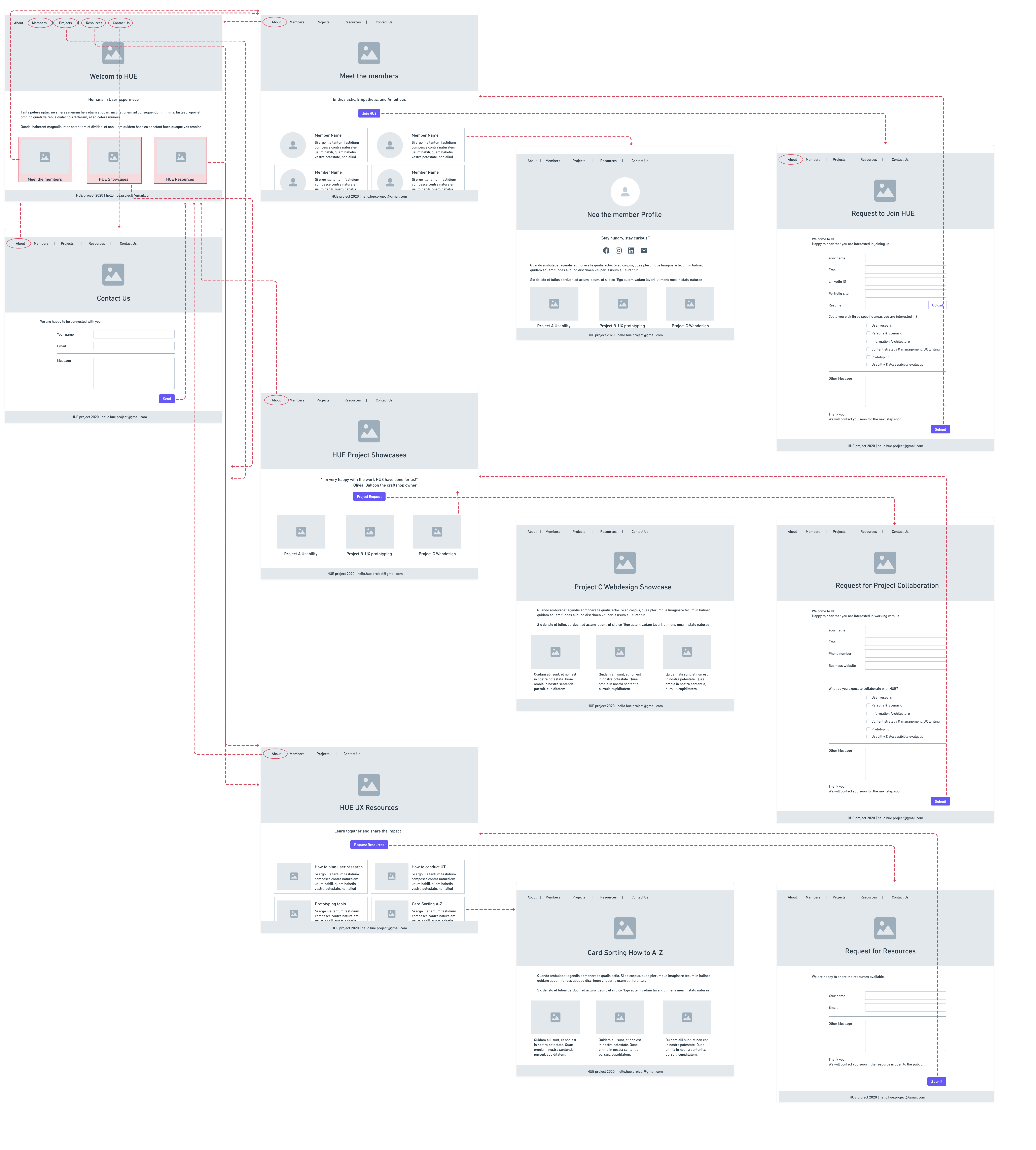
The detailed user sequence and interation points over the wireframes.
We had three rounds of team review with cognitive walkthrough. We found that the mentor information was missing in the wireframe and added the list as 'advisors'. We replaced the inputs with Google forms to make it easier to share and manage the dataset to increase accuracy of data (avoiding bot entries) and ease of database management. The latest revision reflects:
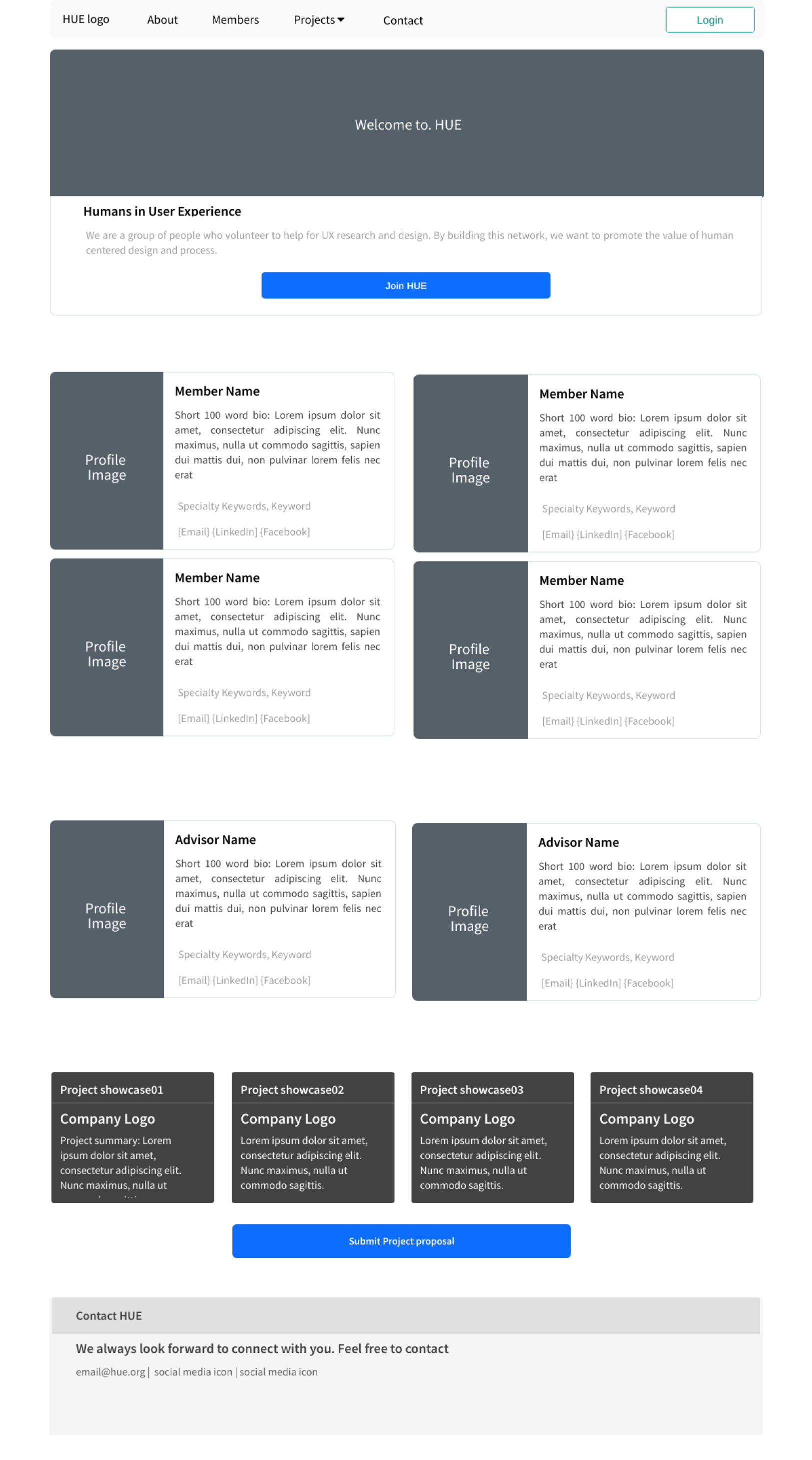
By applying the design system developed with the brand logo (color scheme with warm orange, yellow and dark gray) interface design was drafted and tested. The detail contents were filled with. Accessibility audit was conducted to check the color contrast requirements.
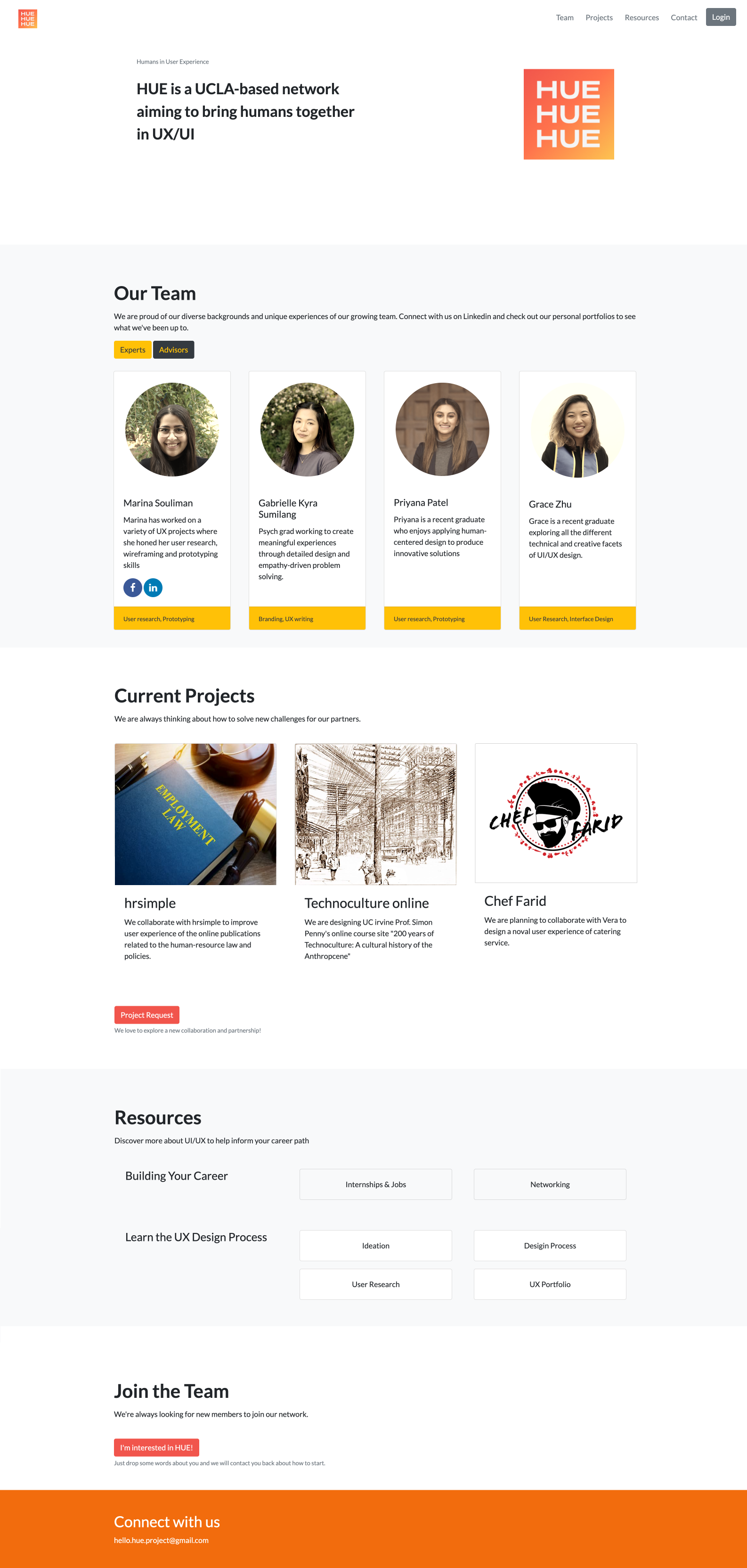
We decided to use the ucla digital humanities webhost (humspace). Bootstrap was used as CSS framework. PHP was used for the member login process.
Experience the interactive Beta Website (2020 Summer)
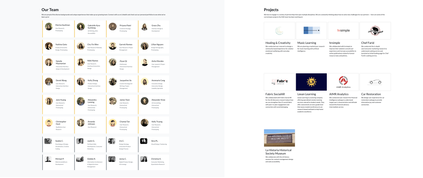
As increasing number of the members and the advisors, we slightly updated the interface design. It needs still more work for the mobile firnedly version.
Experience the current Website (2022 Winter)It has been like starting up a non-profit organization to deal with many ambiguous and ambitious plans. I have learned a lot about value cycles and business-oriented decision-making on top of quality management of members' voluntary works. HUE started as a small group of people who want to continue research and design momentum for voluntary service to the community, but it has been successful to connect people and resources to grow together. We are still working on the process modeling and how to optimize the client collaboration and new member onboarding. We will keep experimenting with a co-creative process on how to model the proper UX research and design practice and consultancy between student members, experienced members, advisors, and future clients.